Navigating Indonesia Earthquakes Interactive
An interactive data visualization that explores the frequent and impactful seismic activity across Indonesia.
- python
- js
- viz
- web
Last modified:
→ Click here to view the project live
View the project in a desktop or laptop for the best experience
Research Question
Topic Selection
As an Indonesian who has experienced numerous earthquakes, I found the subject to be interesting. It drove my desire to comprehend earthquakes and their patterns in Indonesia.
Tools
Python, Jupyter Notebook, Plotly library, JavaScript, D3.js
Data Sources
- BMKG (Meteorology, Climatology, and Geophysical Agency)
- National Centers for Environmental Information
- Earthquake Images
- Center for Humanitarian Data
- World Data
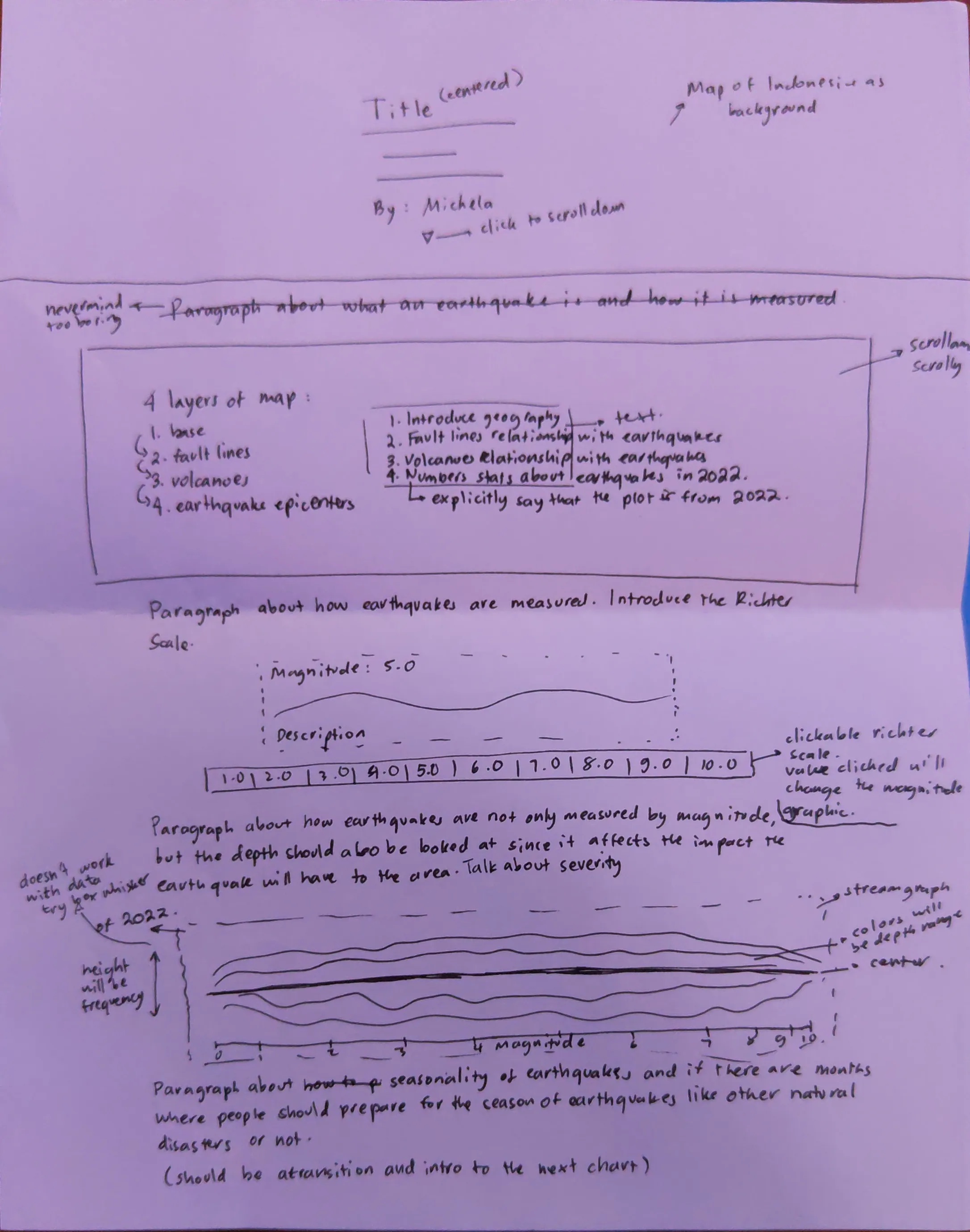
Sketch
The initial sketches laid out the basic structure and story for the project. Using a combination of rough hand-drawn sketches and digital mockups, the layout focused on a vertical scrollytelling format to guide users through various sections.
Process
Developing Navigating Indonesia’s Earthquakes required iterative design and refinement. The process involved:
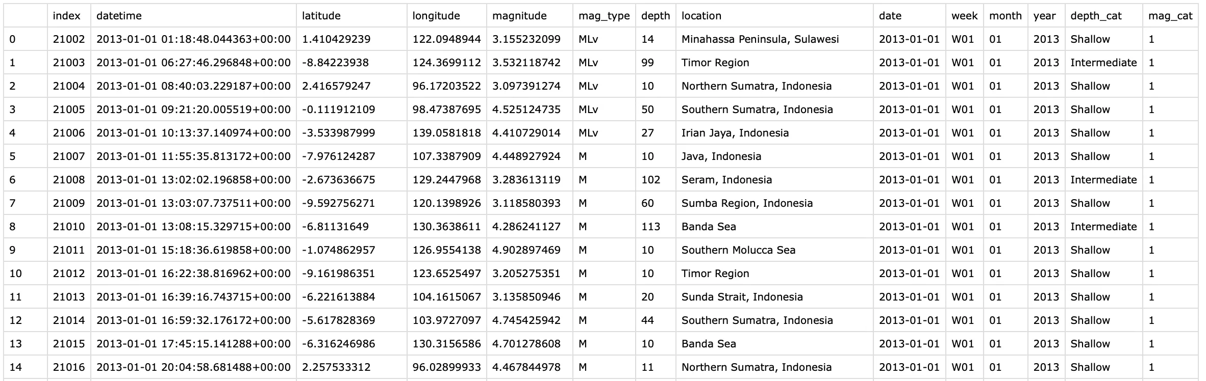
Data Collection and Cleaning
Earthquake and volcanic data were sourced from reliable repositories such as USGS and BMKG, cleaned, and formatted for visualizations.
Coding with Flask, D3.js, and Plotly
Learning D3.js
Flask was used to build a dynamic backend that serves data to the frontend. It allowed me to manage the data efficiently and connect it seamlessly with the visualizations. However, one of the biggest challenges of this project was learning how to use D3.js, as it was my first time working with this visualization library.D3.js was important to create responsive, interactive graphics and maps, but the learning curve was steep. To get up to speed, I had to make use of a lot of resources, including reading books like Interactive Data Visualization for the Web by Scott Murray and exploring countless online tutorials. I spent hours experimenting with small projects to understand the fundamentals, such as how to bind data, create SVG elements dynamically, and manipulate their attributes based on user interactions.
Beyond the basics, I had to figure out how to apply D3.js techniques to more complex visualizations, like layering data on maps, building a Richter scale simulator, and creating smooth transitions for scrollytelling. Each step required a mix of trial and error, debugging, and learning from community resources such as forums and documentation. Despite the challenges, learning D3.js has been one of the most rewarding aspects of this project as it expands my data visualization tools to bring the data to life in a highly interactive and visually appealing way.
User Testing
Early version were tested for user experience and technical functionality. Feedback helped refine the design, particularly around data clarity and interactive features. Several rounds of design tweaks were made based on usability feedback which focuses on enhancing storytelling elements and adjusting color schemes for readability.
Final Graphics Selection
Depth-based upside-down charts
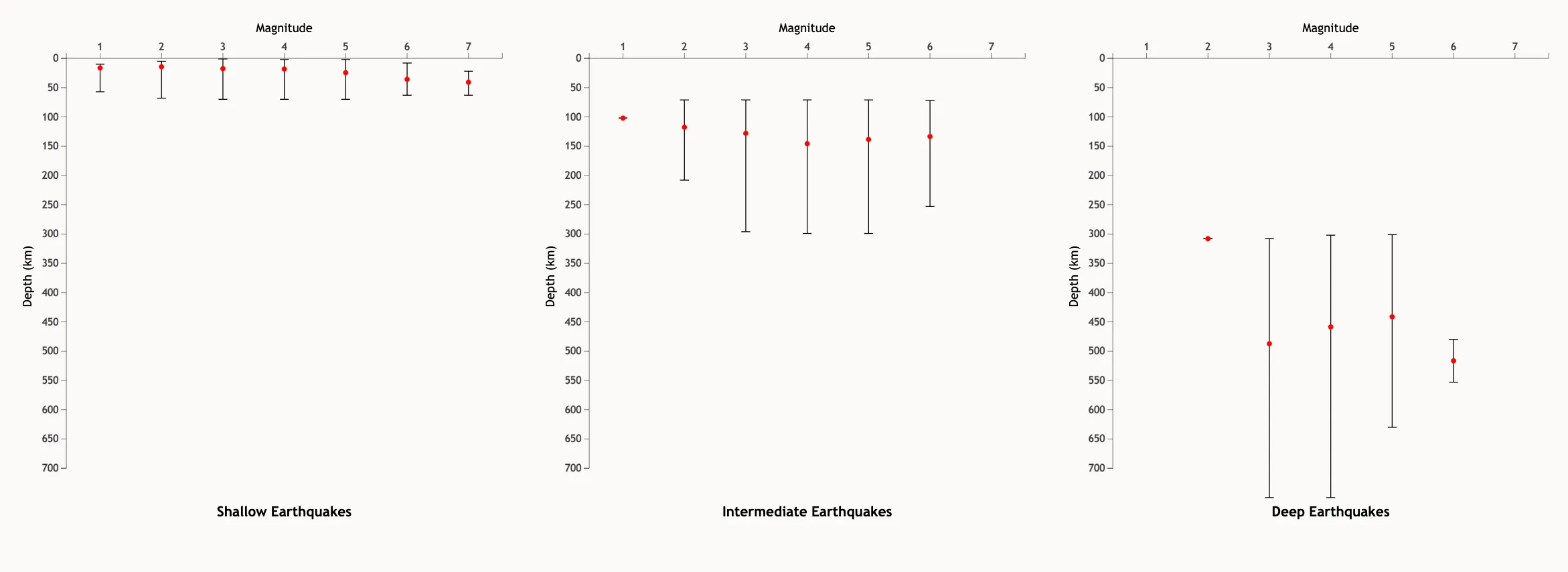
These charts display depth vs. magnitude, categorized by shallow, intermediate, and deep earthquakes. Each chart is revealed sequentially as users scroll, providing insights into how earthquake depth affects Indonesia’s geography.
Richter scale simulation
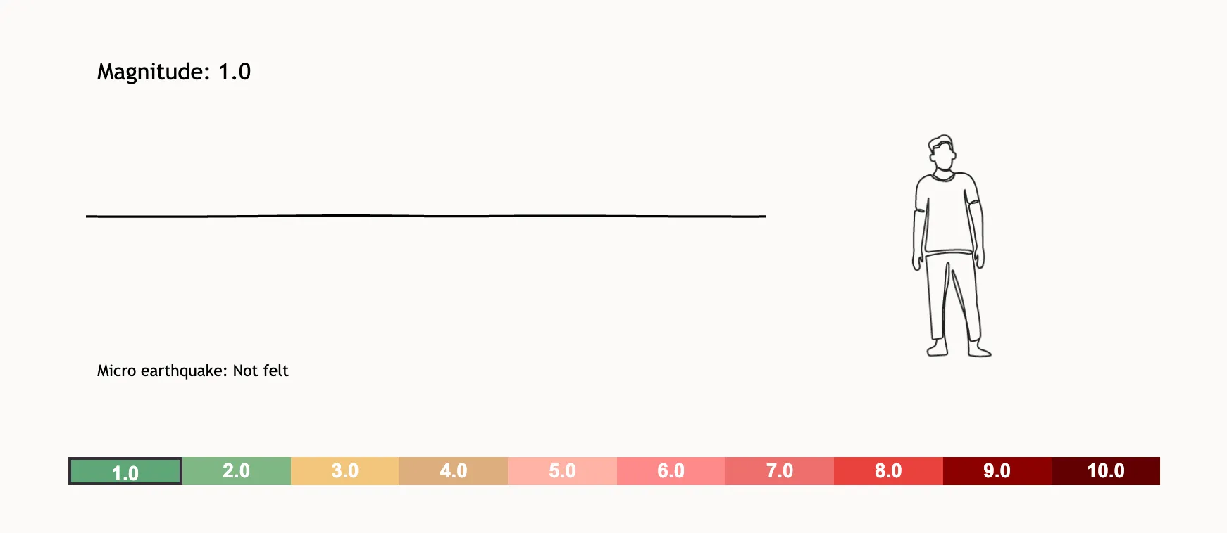
An interactive visualization that simulates building shaking effects for different Richter scale values, giving users a tangible sense of earthquake impact.
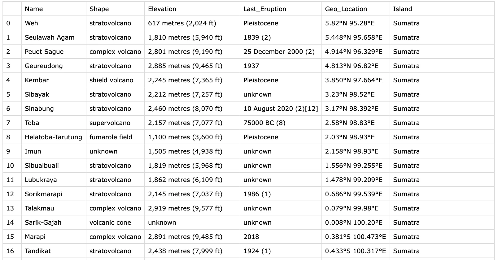
Layered map
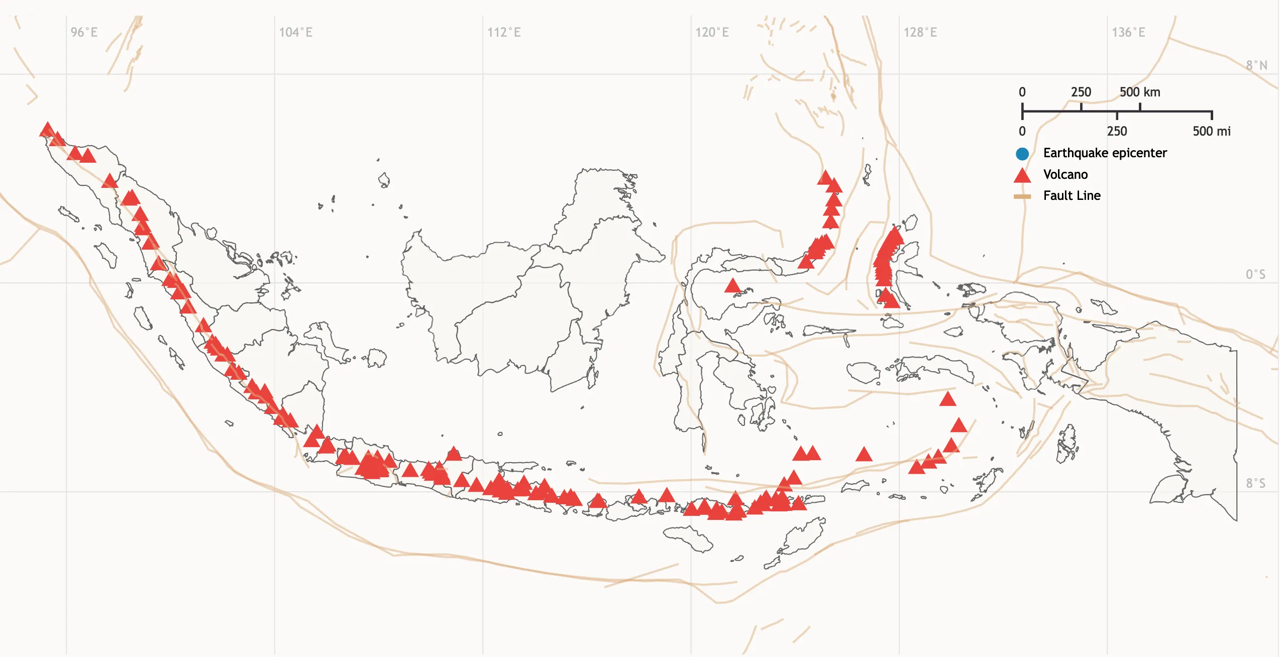
Each layer represents a unique data category, from fault lines to volcanic locations, enabling users to visually explore earthquake patterns alongside Indonesia’s tectonic features.
Final Version
→ Click here to view the project
The final version of Navigating Indonesia’s Earthquakes is a polished, engaging experience that allows users to explore Indonesia’s earthquake data from various perspectives. With interactive features and layered visualizations, the project enables a deep dive into the data while remaining accessible and visually appealing.
Conclusion
Creating Navigating Indonesia’s Earthquakes was a rewarding journey that combined data science, storytelling, and visual design. The project highlights the power of data visualization in bringing complex information to life and providing insights into real-world phenomena. The final result serves as both an educational tool and a compelling example of how interactive media can be used to raise awareness about environmental and societal challenges.
Future Work
- Additional Data Layers: Incorporating data on population density and economic impact to show how earthquakes affect communities differently across Indonesia.
- Predictive Modeling Integration: Adding machine learning models that predict earthquake patterns based on historical data.
- Enhanced Interaction and Animations: Introducing richer animations, such as real-time seismograph effects, and more in-depth data filters to enhance user engagement.