PCA on MNIST Data
The application of Principal Component Analysis (PCA) on the Fashion-MNIST dataset to visualize data in 2D and generate new images.
- python
- ds
- ml
Last modified:
Description
In this exercise for Intro to Machine Learning with Applications class by Dr. Liang, we explore the application of Principal Component Analysis (PCA) on the Fashion-MNIST dataset. The primary objective is to visualize the data in 2D and generate new images using PCA as a generative model. The implementation utilizes the scikit-learn library, particularly the IncrementalPCA module for efficiency.
Data Sources
Fashion-MNIST dataset is employed for this task. It consists of grayscale images (28x28 pixels) of 10 different fashion categories.
Methodology
Loading the Dataset
The Fashion-MNIST dataset is loaded using the scikit-learn fetch_openml function. Images are reshaped into a numpy array, and class labels are extracted.
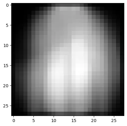
Data Visualization
A subset of images is displayed using matplotlib, providing an overview of the dataset.
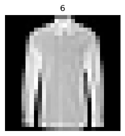
Displaying one of the images
PCA Visualization
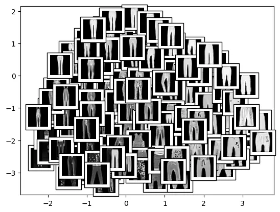
The IncrementalPCA method is utilized for dimensionality reduction to 2 components. Visualizations include scatter plots of data points and separate plots for class labels 0 and 1. The plot_components function enhances the visualization by overlaying images on the scatter plot.
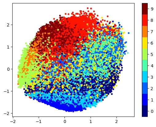
Plotting the data points in 2D
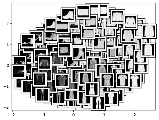
Display data points using plot_components
Display data points with class label 1 using plot_components
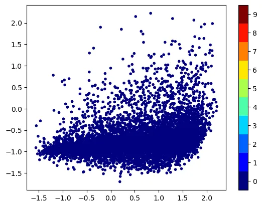
Plotting the data points with class label 0 (target) in 2D
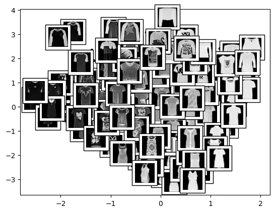
Display data points with class label 0 using plot_components
Generating New Images
The optimal number of components is determined by analyzing the cumulative explained variance ratio. New images are generated by combining random values with the mean and eigenvectors.
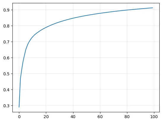
Plot the curve of ‘percentage of variance explained’ (0 - 1) vs n_components (0 - 100)
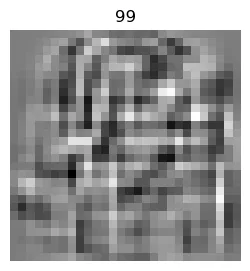
One of the images of eigenvectors
Plot the mean image from PCA
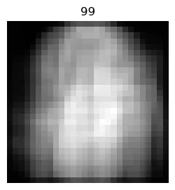
Display the newly generated images
t-SNE Visualization
To complement PCA, t-SNE (t-Distributed Stochastic Neighbor Embedding) is applied to a subset of the data for additional visualization. t-SNE reduces dimensionality while preserving the pairwise similarities between data points, providing insights into the dataset’s structure.
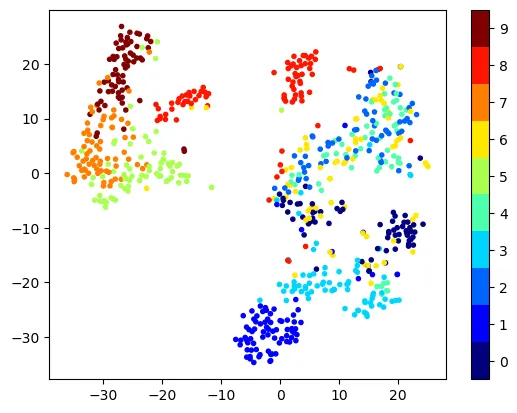
Run t-SNE on subset of data and visualize the data in 2D using scatter plot
Conclusion
- Data Visualization: PCA effectively reduces high-dimensional image data to 2D, providing a visual representation of the dataset’s structure.
- Component Analysis: The eigenvectors (components) extracted by PCA reveal meaningful features in the images.
- Image Generation: While PCA is not optimal for image generation, the process of combining mean and eigenvectors to create new images is demonstrated.
- t-SNE Visualization: t-SNE offers an alternative perspective, emphasizing similarities between data points in 2D space.
PCA proves valuable for visualizing high-dimensional image data and extracting meaningful features. However, its limitations in image generation highlight the need for alternative methods, such as those based on neural networks. The addition of t-SNE provides a complementary view of the dataset’s structure, enhancing the overall understanding.